
In this post we look at how leveraging the data model correctly can simplify our DAX and increases report speed. Using a dataset with 10,000,000 rows we will use Power Query to make a change that reduces the render time for a visual from 15.6 seconds to 1.6 seconds.
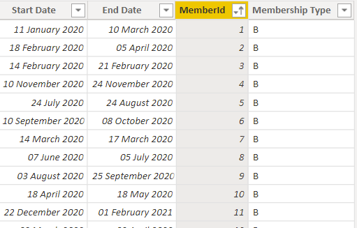
A classic requirement is one of reporting head counts. Often you might have a table that looks like this:
With the requirement to:
- Calculate an average daily membership.
- List members in a selected time period.
This can be achieved by leaving the table as it is and introducing a disconnected date table:
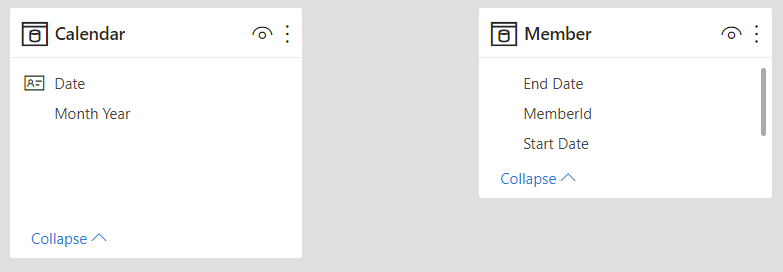
Some work then needs to be done in DAX to move the filters from Calendar to Member.
Average Daily Headcount (DAX) =

    AVERAGEX (
        VALUES ( 'Calendar'[Date] ),
        VAR SelectedDate = 'Calendar'[Date]
        RETURN
        CALCULATE (
            COUNTROWS ( 'Member' ),
            'Member'[Start Date] <= SelectedDate
                && 'Member'[End Date] >= SelectedDate
        )
    )
For a sample dataset with 10,000,000 rows this works efficiently and only took 0.21 seconds. Problems start to occur when a list of members for a date range need to be materialised in a visual. Doing this requires the use of a visual level filter containing similar filter logic:
Enrolment Exists (DAX) =
VAR MinDate = MIN ( 'Calendar'[Date] )
VAR MaxDate = MAX ( 'Calendar'[Date] )

RETURN
CALCULATE (
    INT ( NOT ( ISEMPTY  ( 'Member' ) ) ),
    'Member'[Start Date] <= MaxDate && 'Member'[End Date] >= MinDate
)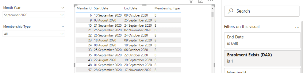
Running the above visual with the same data set took a whole 15.6 seconds to calculate!
The best way to improve this performance is shape our data into a star schema. In the rest of the post we will use Power Query to form an Enrolment fact table with one row per member per day and use our existing member and date tables as dimensions.
Changing the Grain in Power Query
- In Power Query reference the original member table.
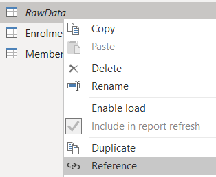
- Rename this new table to “Enrolment”.
- Add a custom column called [Number of days]:
Number.From([End Date] - [Start Date]) + 1 - Add a custom column called [Date] to generate a list of dates per member:
List.Dates([Start Date], [Number of Days], #duration(1, 0, 0, 0)) - Expand this list column to new rows
.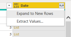
- Set the data type as Date.
- Remove everything except for MemberId and Date
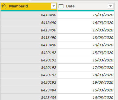
You should end up with a table similar to:
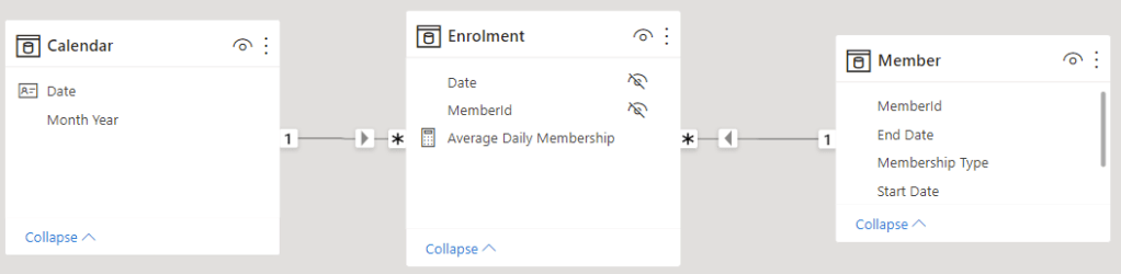
Create a Star Schema
Going into the model view we can now create relationships to form a star schema.
Simplify the DAX
The Average Daily Membership measure can now be simplified to the following as we can leverage the data model:
Average Daily Membership =
    AVERAGEX (
        VALUES ( 'Calendar'[Date] ),
        CALCULATE ( COUNTROWS ( Enrolment ) )
    )
Note that we still need CALCULATE to cause a context transition for each date.
Check the Timings
Using this to calculate average daily membership takes 0.18 seconds. Marginally faster than before but not noticeable. The important thing here is that even though we’ve added lots of rows performance is so far at least just as good.
The advantage with our new setup though comes when we want to list members during a particular period. There is no longer any need to use a visual level filter, we can just drop the columns we want in. Just make sure you include the MemberId from the Enrolment table. Previously this took 15.6 seconds whereas with our new setup it only took 1.6 seconds!
| Task | With DAX | With Model |
| Calculate the average daily membership | 0.21s | 0.18s |
| Show list of members for a selected period | 15.6s | 1.6s |
As is often the case when optimising dax, the model change moved a large amount of the work out of the formula engine and into the VertiPak storage engine which loves long thin tables like this!
Coming from an excel and more recently SQL background the idea that adding more rows to a table could make things run faster seems totally counter intuitive. However I hope I’ve demonstrated that sticking to a star schema with a fact table at the grain you need to work at, not only simplifies your DAX but can also speed up certain reports. Further more once you have a star schema it becomes easier to further expand your data model should you need to.
If you have an example where changing the model has led to a significant performance boost or a simplification of your DAX I’d love to hear about it. Please do share in the comments below.

This approach is great. I’m working with exactly these sorts of calculations for headcount at the moment, with loads of legacy spreadsheets I inherited. These are piled high with hundreds of SUMIFS calculations to figure out headcount per month. As we move to Power BI for report generation, it is worth remembering to also change the model to better suit the platform. I am sure this will save us time and frustration in the long run, thanks!
LikeLiked by 1 person